


 JUST MY TYPE: Choose the best fonts to emphasize your theme
Fonts matter. A creepy Halloween font would be a terrible choice for a wedding invitation. But it would be downright thrilling for a ghoulish costume party.
Typography plays a pivotal role in the look of your yearbook. It’s essential to choose fonts that enhance the theme and not distract from it. Here are five tips to make the most of your font choices.
-
Limit your type choices to two or three fonts.
Less is more. It’s preferred to select two or three fonts to use throughout the book. This provides the reader with consistency. With hundreds of font choices, it’s tempting to utilize multiple options, changing the type from page to page. But this can lead to confusion for the reader and create disharmony in the book.
-
Choose a font family.
It’s helpful to choose a font family for your main type choice. In addition to a font in the regular or Roman typeface, a font family provides additional weights like bold and italic. A large family may include light, medium, demi and black typefaces or even condensed and extended versions. Think of your font as not just having brothers and sisters, but also aunts, uncles and cousins. This establishes a consistent look throughout the book, but also gives a little contrast. Having different weights of the same font will lend itself to more appealing headline treatments for main stories and modules.
Foundation Sans family
-
Add an additional font for creativity and emphasis
A font family provides contrast, but an additional typeface can add the wow factor. Choosing a second font can add fun and creativity to the design. This font might be decorative or a script font. Or it could be as simple as a modern serif that lends beauty to the page design. Modern serifs are distinctive for their radically thin and thick strokes (think of the Vogue, Bazaar or Elle’s mastheads).
Decorative and script fonts should be used sparingly and for emphasis. With headline treatments, focus only on key word(s) being in the additional font, possibly even adding color to the word. Avoid writing phrases or entire sentences in a decorative or script font—it’s too challenging to read in small sizes.
-
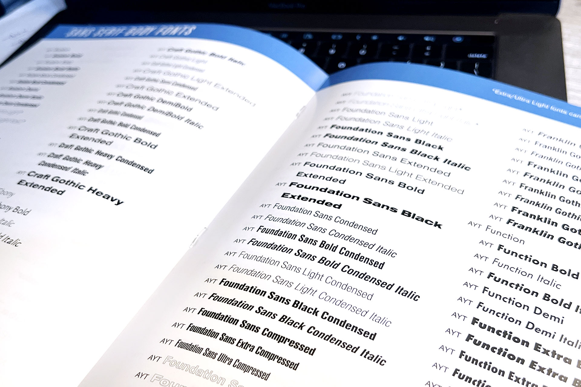
Utilize the font book for decision making
Take advantage of our font guide when considering fonts. Divided into type classifications, it shares serif, sans serif, decorative, script and ornamental options. You’ll be able to assess the look of each font and quickly see which fonts have multiple weights. After you’ve noted a few you like, it’s a smart idea to test them out in Layout Pro or Monarch, to see how they look on a page.

-
Use type hierarchy to designate importance on a spread
It’s not only fonts that matter. Size plays an integral role too. Type hierarchy, the arrangement of headlines in relation to size, tells the reader the level of importance. The largest headline, typically near the dominant photo or package, helps anchor the spread. It indicates to the reader “Look here first.” Headlines on other modules are noticeable smaller, a nod to the importance of the primary headline.
Type hierarchy is clearly visible in this academics spread from Liberty Hill High School. The primary headline, placed with the main story package, is significantly larger than any other headline. Note the usage of color and a handwriting font to add contrast and visual appeal.

Liberty Hill High School [TX]